Tuesday, 12 December 2017

Give your event display a professional edge: hire a promotions team!


We’re always telling you how important it is to invest in professional display material at trade events.  That’s because we understand all too well how hard it can be to stand out and make the right first impression in an endless sea of exhibitors. 

Hopefully, you’ve been taking our advice and your eye-catching displays are now the talk of every event you attend!  Now there’s just one more question…are your team up to the job of promoting your company in the same engaging way as your wonderful stand?

We hate to ask.  After all, no doubt your own team are professionally trained promotions people who engage openly with everyone they meet, generating lead after lead like the proverbial hot cakes.

If by any chance they’re not, you could do a lot worse than hiring dedicated promotional staff at your next event.

Our case for calling in the professionals

Exhibition visitors will judge your business by the quality of your stand, but also by the quality of your staff (we know, it’s a harsh world out there). 

The way your staff interact with visitors is paramount: their approach has to reflect the vibrance and personality of your brand completely.  If your own in-house team have other essential jobs that involve keeping actual business operations running smoothly, it can be hard for them not to be distracted on event day.

However, the decision to hire in professional promotions staff can still be a difficult one.  How do you know what kind of people you should hire to best represent your company?  What attributes should you be looking for, and what skills should they have?

Take a look at our handy checklist, and never be let down by your stand staff again!

Check if they’re approachable

We know; it’s an obvious one.  Yet we’ve seen many companies make the mistake of relying on attractive promotional staff to draw in visitors, forgetting to check whether or not they can interact well with people and make them feel comfortable.  So do check.  Meet your potential staff before the event, and note your own first impressions. 

Familiarise them with your brand – and your plans

Promotional staff are professionals, but you’ll still have to tell them about your brand in order for them to properly integrate with it.   Ensure they understand exactly what your company does, and how to answer the most common questions you’re asked about it.

Make sure you explain exactly what you’re looking for from your new staff, and that they’re committed to working with you.

Plan a clear lead generation strategy

Don’t thrust a clipboard at your brand-new promotional staff and expect them to just get on with it!  Plan your ideal approach, and make sure your staff know what details they should collect when they engage with visitors. 

Studies show that companies who plan their lead generation strategies gain better data and build stronger client relationships after the event, so this is a task that is well worth doing regardless of who your event team are.

Make sure they have the right skill set for your event needs

In the world of professional promotions, one size doesn’t fit all!  What is the objective of your attendance at the show?  If you’re informing visitors about a new product or service, you’ll need your staff to present well.  If you’re looking to collect contact details, they will need excellent lead generation skills.  Oh – and if you’re exhibiting abroad, multilingual skills are a must.

If you get the process and preparation right, hiring professional stand staff could be what turns a vaguely interested prospect walking past your stand into an actual client.  Better still, you won’t have to worry about staff sickness or office politics hampering the day!


Now you’ve got the right staff, let’s get back to that display stand.  Is it representing your brand at its best?  Whatever the event-related question, our team will have the answer, so why not get in touch?

Thursday, 23 November 2017

Six handy tips to maximise the life of your exhibition graphics

  It’s a known fact: you’ve got a mere matter of seconds to grab visitors’ attention at trade shows. You may wonder, as you study the plans for your chosen exhibition, what the best attention-grabbing method could possibly be?

The answer is simple.  Invest in a stand that features one of the highest-impact components available.  In short, we’re talking about graphics.

We know from experience that exhibition stand graphics matter. A lot.

Correctly displayed and bespoke-designed to reflect your brand at its best, your graphics are guaranteed to work extremely hard at your event, generating mesmerising impact that will see you stand out amongst your competitors for all the right reasons.

So it goes to follow that scrimped investment in poor quality, lazy graphics won’t cut the mustard – which is something we’re sure you already know.  That’s why you did the right thing and commissioned a designer, decided on a key brand message and then, voila!  You’re in proud possession of a set of compelling graphics that attract interest every time they’re used.

Congratulations on getting those graphic panels just right.  Now you need to focus on taking proper care of them. 

In doing so, not only will you protect and maximise your hard-earned investment by removing the need for regular replacements…but if you take good care of your graphics, your graphics will take care of you (cheesy maybe, but also very true!)

So how exactly do you take good care of those graphics? 

1. Roll with care

Always roll flexible panels with the graphics facing outwards.  Why?  If you do this often enough, the panels will develop a ‘memory’ that will pull them naturally onto your stand frame. 

If you roll the panels with the graphics facing inwards, the opposite will happen.  The panels will do everything they can to avoid the frame, and your graphics won’t attach properly.


2. Avoid footprints

Place your graphics directly onto your stand frame the moment they’re taken out of their case.  Not laying them out on a potentially dirty floor first will keep them clean – and avoid said footprints!


3. Roll with care – Part Two! 

When it comes to packing your panels away, roll each one individually, placing them inside one another in your storage case. 

Yes, it’s probably quicker to lay them all out and roll them up together, but you’ll save more time by not having to separate them later on.


4. Remove your graphic panels in an orderly fashion

Reverse order, to be precise.  Doing this will mean that when you use those graphics again, they’ll be nicely packed in the right order for you to re-attach quickly and easily.


5. Keep your graphics clean!

An obvious tip, but one we’ve witnessed many companies ignoring. 

The graphic panels we produce here at Guardian Exhibition & Display are laminated, meaning there’s no excuse not to keep them clean when it’s such a quick and easy task. 

A handy pack of baby wipes or some glass cleaner will do the job perfectly – and while we’re on the subject of cleanliness, don’t cover your expensive display in Blu-Tack or Post-It notes!


6. Case in point

Keep your graphics safely stored inside their case between events.  If you have different panels for different shows, labelling the cases will save you time (not to mention potential embarrassment!)


So there you have it.  Mostly effortless methods to keep those graphics working as hard as you do at your next event – and beyond!


Can we help you with anything graphic-related?  From initial consultation to illustrations, 3D-visualisation and final design, we’re on hand to make your exhibiting life that much easier.  Contact us (here).

Monday, 13 November 2017

Sales mistakes made on stand: Are you guilty?

 Do you want to lose potential clients, miss out on opportunities for leads, or be generally thought of as a company that’s bad to do business with?

Thought not!  Although we have to admit, judging by some of the sales mistakes our team have witnessed at exhibitions over the years, you could be forgiven for thinking those were the direct objectives for some exhibitors.

We all know how great an opportunity exhibiting your brand at a trade event can be.  After all, how many chances would you usually get to promote your company to such a large audience of industry insiders, experts and prospects, all under one roof?

To help you make the most of this amazing opportunity, we’ve decided to tell all about some of the worst mistakes we’ve seen salespeople make at exhibitions, so you’ll know exactly what to avoid.

(Brace yourself – some of these are pretty shocking!)

Casting judgement
People judge people.  It’s instinct.  But when you’re exhibiting your business and meeting countless new people, it’s important to treat everybody with the same level of friendliness and respect.

This means not staring at name badges as people walk past, trying to work out who you should be spending your precious time chatting to.  Not only is this rude (people will always know you’re doing it, however subtle you try to be), but job titles are often deceptive – or perhaps even completely made up in some cases! – so you could be missing out on key business.

Not being welcoming
We’re not saying you need to grin inanely at everybody who walks past your stand.  But do smile, and do try to engage people who look interested in what you do, so they don’t go and talk to your competitors instead.  It’s that simple.

Texting, reading or eating on the stand
We know: who actually does this?  Unfortunately, quite a few people we’ve seen!

It should go without saying that anything that takes attention away from the people around you is a genuine waste of valuable exhibition time (would you want to approach someone staring down at their phone, or engrossed in the latest Dan Brown?)

If you need a break, take one – just take it well away from your stand.

Drinking too much the night before
If you’re staying away for an exhibition, the temptation to have a few drinks in the hotel on the night before can be overwhelmingly strong. 

Resist!  You’ll look, feel and smell terrible – and unless your ideal client is Rab C. Nesbitt, that combination isn’t something you’ll want your brand to be remembered for.

Breaking down the stand too early
It can be so tempting, can’t it?  The crowd is starting to thin out anyway, you’ll have an easy drive home if you miss the worst of the traffic, and after all it’s been a long week…

Don’t do it.  You never know when your best prospects might turn up, and in our experience there’s a certain kind of arrogance that goes with leaving your stand space empty, while people may still be interested in talking to you – and have often paid for the opportunity to do so.

(Here at Guardian Exhibition & Display, our friendly team are more than happy to pack up and break down your stand for you, meaning you may just be able to catch that early train after all!)

A great rule of thumb is to think of your stand as a formal client meeting space.  All the same rules apply – if you wouldn’t chew gum, turn up hungover, leave early or stare down at your phone in a formal meeting, don’t do it on your stand!

So by now we’re sure you know all the wrong ways to work that stand, but do you know the right ones?  Our team are only too happy to discuss all things exhibition-related, and we won’t even ask for your job title!  Get in touch with us (here).

Thursday, 2 November 2017

Drum roll please…for our brand-new website launch!


Now that the clocks have gone back (we hope you enjoyed that extra hour!), we think all this cosy winter hibernation time is ideal for change and renewal. 

With this in mind, we are very proud to present our brand-new website!

We’ve always understood that every stand we are asked to create is as unique as the client themselves, which is why we’re able to showcase so many different examples of our work – along with plenty of information about the many products and services we offer, of course.

But we decided that wasn’t enough.  In redesigning our website, we wanted to take the opportunity to answer some of the most common questions we’re asked here at Guardian Exhibition & Display, and create an online hub that’s as user-friendly, helpful and informative as we are in person!

So, what exactly can you expect to find on our new site?

Well first, we hope you’ll enjoy the user-friendly layout that makes it incredibly simple for you to choose between different stand options. 

Baffled by all the choice on offer?  Our handy Stand Finder means all you need to do is enter your requirements into the home page, and we’ll instantly recommend the best stand for you.

Meanwhile, our brand-new shop makes buying a stylish portable stand even easier – but beware, with so much choice you could spend a good while browsing (just make sure that coffee mug is fully charged!)

Thought we were all about stands, stands and more stands?  Though we love nothing more than creating the perfect stand solution for your brand, our team has varied expertise that goes way beyond the exhibition hall.  Our dedicated Event Branding area proudly showcases our expertise in an area of event management that is becoming extremely sought-after.

We’ve been busy producing everything from event signage and window vinyls, to digital wallpaper and banners for some of the most prestigious events around.  Why not take a look, and find some inspiration for your next event?  After all, we know how hard the planning process is, and we know you won’t want to simply throw up a few posters on the walls and hope for the best.

We know…we know, all this talk about stand creation, dazzling displays and bringing brands to life.  If only we could actually show you more about how we work, and provide a little extra information at the same time!

Our new selection of product videos do exactly that.  We understand that setting up and breaking down stands can be complicated, and though we provide plenty of on-site expertise, we know that sometimes you’ll just want to get on with it yourself.   Our handy videos will explain more, and show you exactly how the pros do it!

And what if you wanted to know a little more about these display pros?  Our Meetthe Team page will give you the lowdown on who we are, what we do and how we’re qualified to help bring your brand to life – with a few extra fun facts thrown in! 

Hopefully, this means that by the time you get around to meeting us in person, you’ll already feel as though you exactly know who we are – and more importantly, how we’re able to help you.  Why not familiarise yourself with our stylish showroom, too?

If you still can’t get enough of our team (and we wouldn’t blame you for that!), why not come and follow us on social media?  Our Instagram account provides plenty of stand-spiration, while our Twitter feed is packed with event tips.


In the meantime, we hope you enjoy browsing our new website.  We’d love to hear what you think…and if we haven’t already, we look forward to meeting you soon!

Friday, 13 October 2017

When size really does matter: making the most of a large exhibition space


So you’ve bitten the bullet and booked a larger-than-usual spot at the perfect trade event. 
At first, you had some vague plans to wow prospective clients with brilliant branding, on-target messaging, and maybe even a coffee machine and a few chairs.  But now you’re counting down the days to the show, and you’re feeling intimidated by all that space, unsure about how to maximise it to its full potential.
Does any of this sound familiar?  If so, take heart that in our experience, bigger can definitely be better – and with a little help from our team, you’ll be dominating that floor space in ways visitors just won’t be able to resist!

Start with height

A large space combined with height = domination extraordinaire!  Choose a tall stand, so that eyes are drawn to your brand right from the get-go.

Continue with colour and clarity

You probably don’t need us to tell you that bright colours will help create presence and help you stand out.  But the thing is, they do – and in a larger space they’ll make even more of an impact. 
However, don’t get so carried away with colour that you forget to be clear!  Your branding needs to be at the forefront here, so make sure it’s big, bold and easily visible from a distance.   If you’re using screens (something we definitely recommend!) then make sure they’re a minimum of 55”, so they don’t get lost in a sea of colour and branding.
You should be aiming for all eyes to be immediately drawn to your display, and that devastating combination of size, height, colour and clarity is the perfect start.

Add a touch of comfort and convenience

If you’ve got space, you’ll have the luxury of being able to add plenty of seating.  Choose a mix of formal and informal, so that whatever the conversation, there will always be somewhere appropriate for people to sit.
If you can, consider including a shielded meeting area for private chats (or if you want a quick gossip about the other exhibitors!)

Make the absolute most of your space

Where smaller exhibitors might struggle to squeeze in pieces of kit on their stand that end up causing obstructions, on a larger stand space is your best friend. 
So eliminate any barriers that may stop visitors from approaching you.  Don’t be scared to leave some areas clear of anything at all, allowing people to move freely around the stand and create a buzz that others will want to be part of, too!

Brief your stand team well

A large, visitor-attracting stand needs plenty of staff.  Make sure you’ve got enough proactive people on the day, and allocate dedicated jobs beforehand, i.e. someone to meet and greet, another making tea, and another to act as the fountain of all product and company knowledge.
Incorporate plenty of time for rest breaks so your team aren’t tired, have plenty of time to polish up their smiles, and can perform at their absolute best when chatting to potential clients.

And finally, the practical bit

You knew it was coming! 
Don’t think having extra space means you can stack your stand with all that extra literature and giveaway items you’ve ordered, “just in case”.  Instead, make sure you include a dedicated storage area so that these items can be hidden, yet still accessible.
Consider raised platforms to allow any cabling to run underneath your space and help define it.  Carpeting in different colours will also help section out different areas on your stand.
Still feeling unsure about how to maximise that space?  We didn’t think so! 

You’ll be pleased to know that our friendly team are always on hand to answer plenty of other event-related questions, too.  When it comes to exhibitions, there’s isn’t much we don’t know – so why not test our knowledge by getting in touch (here).

Friday, 29 September 2017

Give that ugly shell scheme a makeover! Simple tips to stand out at your next event

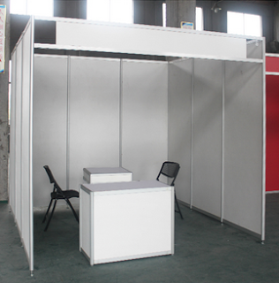
If you’ve exhibited your business before, or you’ve attended trade events in the past, you’ll probably be familiar with the term “shell scheme” – a modular system with walls that defines each company’s exhibition space at the event. 
Now it has to be said that a shell scheme in its natural state doesn’t exactly inspire. If you were visiting a trade event, would this basic shell scheme below tempt you to wander over? (Let’s assume your feet aren’t aching and you don’t need somewhere to sit down – fast!).


Now compare it with this lively stand, primed to catch your eye with lively graphics and plenty of colour.


Though none of us dress exactly like Gok Wan, our team at Guardian Exhibition & Display are shell scheme makeover specialists.  We’ll help breathe colour, life and energy into your exhibition space, with a creative and professional on-brand stand that visitors won’t be able to ignore.
We’re pretty generous with our knowledge, too – so if you’re looking for tips on how to make your shell scheme sparkle, look no further!

Cover up those boring walls

We’re sorry to tell you this, but half-heartedly Velcro-ing a few posters just isn’t going to cut it.
In a crowded exhibition hall, you’ll only have seconds to make your first impression.  A flexible stand solution allows you to do just that, filling your entire space with much-needed colour and interest. 
Better still, as flexibility is the name of the game, Versaform stands can be reshaped to fit any space, and your graphics re-used for later events – meaning plenty more people will have the opportunity to be enthralled by your brand!

Don’t be afraid to get creative

Imaginative graphics demand attention.  Don’t worry if you’re not artistically inclined, as our design team come fully equipped with some great ideas to get you started.
Alternatively, how about arranging an old-school creative session with your team?  Book a meeting room, grab some paper and pens and let your imaginations loose!

Fill your space completely

Just as 1950s housewives were encouraged never to leave the house without their ‘face’ on, don’t let anyone see your shell scheme in its natural state. 
Let’s not forget that your company is going to be judged – most of the time completely unconsciously – on how it looks as people stroll past.  You want them to stop in wonder, not because they’ve spotted something that doesn’t seem quite right.
Not only that, you’ve probably spent quite a lot of hard-earned profit on that precious floor space – so doesn’t it make sense to make the most of it?

Encourage visitor interaction

Trust us, good coffee and comfy seating are always a great start! 
You can also remove any fascia boards and corner posts to create a feeling of openness – and of course, always make sure there are no obstructions in people’s way as they approach you.

Give your team a makeover, too!

We’re not talking tassels and sequins (unless that’s part of your brand, of course!)  But you do need to make sure that the your event team look the part, in keeping with the style and impression of your stand.


If your shell scheme could do with a much-needed makeover, we’re the experienced team you need to contact.  We come complete with an inspirational and diverse portfolio of stunning stands for clients across all industries – to take a look, or to begin a friendly chat, simply contact us (here).

Friday, 15 September 2017

Working the glow factor – why you should use a lightbox at your next event!


If you’re anything like our team here at Guardian Exhibition & Display, you’ll have nurtured a lifelong, secret desire to see your name up in lights.

Now you can make that secret dream come true for your brand, by incorporating a LED lightbox at your next exhibition!

Vanity aside, if you’re looking for the best ways to beat the competition and attract more visitors to your stand, clever use of lighting is a fantastic solution that always enthrals.  Just ask any artist or photographer.

Yes, we know your chosen venue will have its own lighting – we don’t hear of many events that take place in a dark underground cave, after all – but given the amount of enquiries we’re starting to receive about our amazing lightboxes, it seems people are catching on to the fact that bespoke lighting makes a huge difference when it comes to attracting attention.

Illuminated advertising is an essential attraction element that many high-end High Street stores have been effectively using for years – next time you’re strolling along London’s Oxford Street, why not check for yourself? – so why share the spotlight with your competitors, when you could generate your very own?

Allow us to shed some more light on the subject for you!

Lightboxes attract attention

We can’t help being hardwired to notice bright, colourful things over dull, bland ones.  It goes to follow, then, that a winning combination of colour and light is guaranteed to attract more visitors than a stand relying on colour alone.

This is a theory that is ably backed by market research, which consistently shows that illuminated advertising drives more attention, enquiries – and ultimately, sales – to a brand than non-lit advertising of the same type.

Your brand will appear more vibrant than ever before!

High resolution graphics are created from tension fabric panels, and then illuminated with bright LED lighting that distributes even levels of light across the graphic surface. 

Event visitors will have no choice but to look, without even thinking about it – meaning that from the moment they enter the exhibition hall, you’ll be leaving your competitors in the dark.

You can use lighting in whichever way works best for your brand

Use a floor standing lightbox for all-over illumination, or integrate lighting as a bespoke part of larger stands to highlight particular messages, images or branding elements. 

Enjoy the opportunity to get really creative here – why not brainstorm your ideal stand components, and see where you could throw some extra light to captivate your visitors!

We offer a complete range of lighting options for your stand, so whatever method you choose, and whatever option you decide upon, our friendly and knowledgeable team can bring it all to life.

We also know very well that the best way to explain more about lightboxes and bespoke lighting options is to show you! 

So why not head on over to our website to view some examples of our work and learn how to see your brand in the very best light possible – or better still, arrange a free demonstration to view all the potential of bespoke lighting right up close?  We guarantee you won’t regret it!


Interested?  Simply contact our team (here) to get started.